Introduction
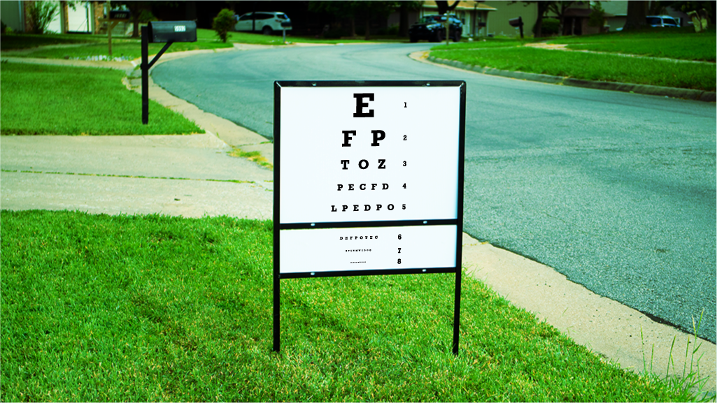
An unreadable sign is a waste of your money because it fails to deliver your message to viewers. And if people don’t get the message, they won’t take action.
Use these three design tips to ensure your viewer gets your message, every time.
1. Use Contrasting Colors


Contrast helps the viewers eye differentiate easily between your signs copy and imagery. Choose colors that contrast well with each other. There are online color picking tools that can help. A good rule of thumb is if the text is light, make the background dark. If the text is dark, make the background light.
2. Use Easy to Read Fonts


Decorative fonts are a lot of fun to use and can give your design personality. But be cautious not to pick a font so stylized that the message is unreadable. If you need to use a stylized font, make the text larger or add space between the letters(kerning).
A good rule of thumb is to use a sans-serif font for any small text. Serif fonts can still be used, but are typically better for text that will be large.
3. Edit Your Text


If your sign has too much text, people won’t even try to read it. Edit your text down to the bare essentials. Then decide what the central message of your sign needs to be. Make the central message the largest. Any extra information should be a smaller font. People will read the main message and understand quickly what your sign is about. If they are interested in knowing more, they will keep reading.